OUT OF ORDER


Project overview
The brief
Out of Order is a streetwear label that does not want to look like it follows the rules. It needed an identity loud enough to carry a hoodie back from across a room, and a story small enough to fit on a neck label.
The idea
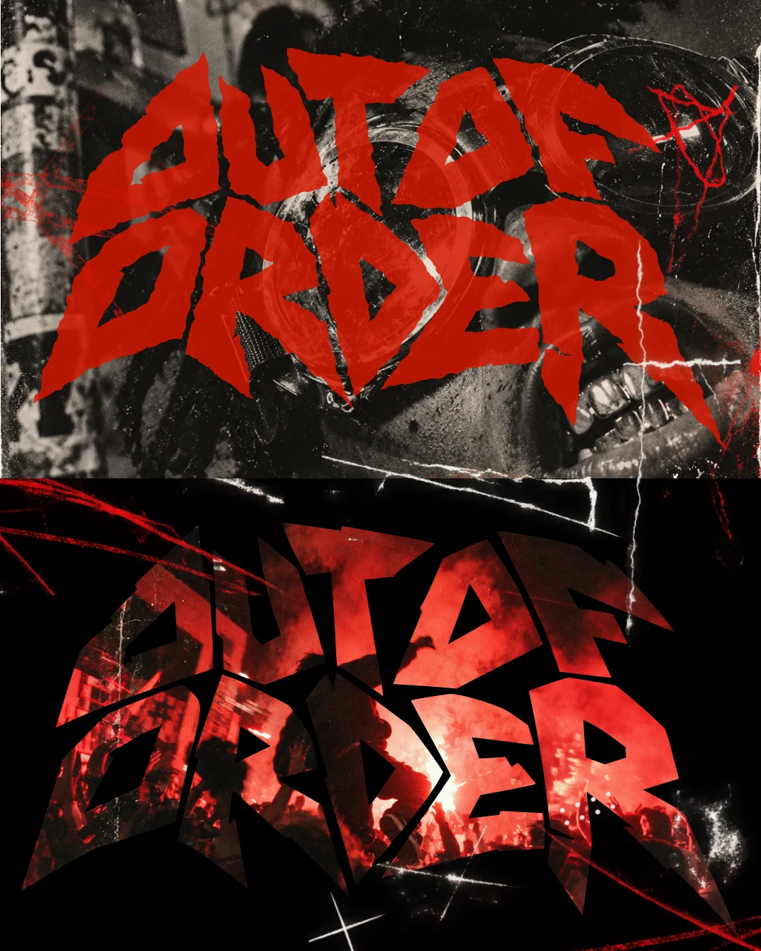
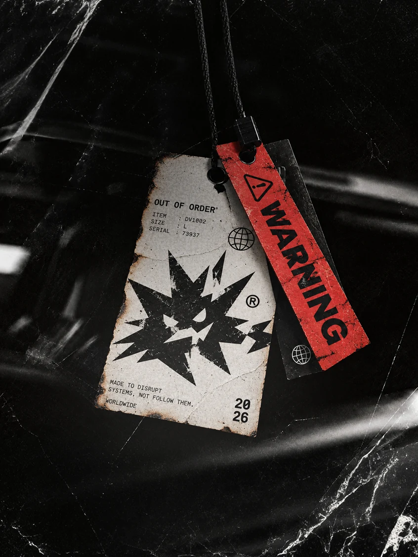
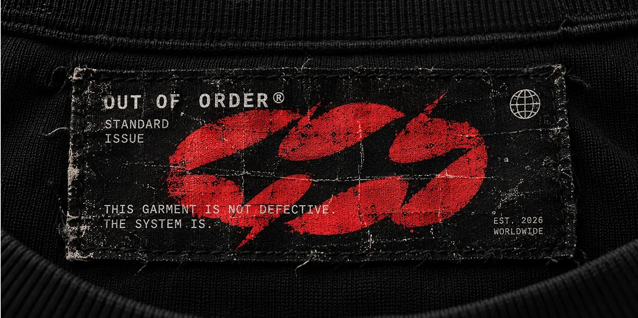
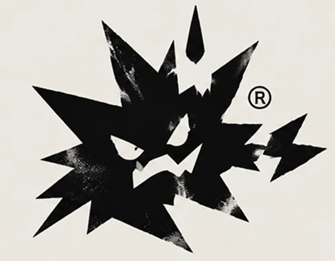
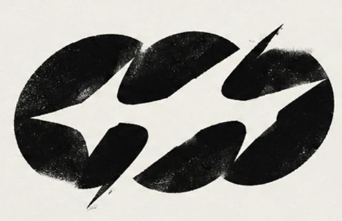
One line runs the whole brand: “This garment is not defective. The system is.” The identity is built to look broken on purpose. A cracked, torn logotype in blood red. A black burst with an angry face as the mascot, and a twin-orb mark split by a lightning cut. Everything is printed as if it survived something: scratched, burnt, creased and worn.
What we made
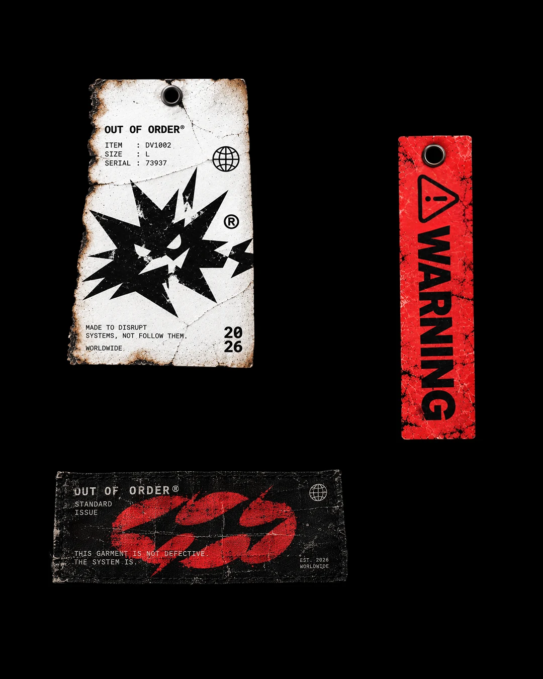
- Logotype and secondary marks: the cracked wordmark, the burst mascot and the twin-orb symbol
- Woven neck label with the brand line
- Hang tags: a burnt-edge paper tag and a red WARNING strap
- Hoodie back graphic and logotype artwork for posters and campaign visuals
- Colour, typography and a mono-spaced label voice (“ITEM / SIZE / SERIAL”) that makes every garment feel like a piece of evidence
The result
A label with its own language. Red and black, damaged on purpose, with every detail, from the serial number to the warning tag, pointing back to the same idea. It works on a neck label the size of a thumb and on the back of a hoodie in a dark car park.